
Memories made during youth sports stick with players, parents, and coaches forever. A fundamental goal at MOJO is to make the process of capturing memories fun and easy. The MOJO player profile is a hub for parents to manage, curate, and relive these memories with their players, friends, and family.
There have been two main iterations to get the player profile to where it is today. Both are outlined below.
Primary metric: user engagement 1) creating player cards, 2) adding memories to their timeline, and 3) tagging memories
A key focus was developing the fan experience for the MOJO app. To do that, we first needed to build its foundation. This was one of our team’s largest projects, requiring many iterations to reach our vision.
Most competitors in youth sports focused on logistics over the fun. They overlook the importance of memories, friendships, and highlights. We saw an opportunity to change that and make sports more enjoyable.
.svg)
We ran a competitive analysis and found few direct competitors offered similar features. For inspiration, we looked to Hudl, Instagram, ClassDojo, and Twitter. All are apps centered on feeds and memory sharing.

It was crucial to plan the rollout in phases. Each release needed to stand alone while building toward the larger vision.

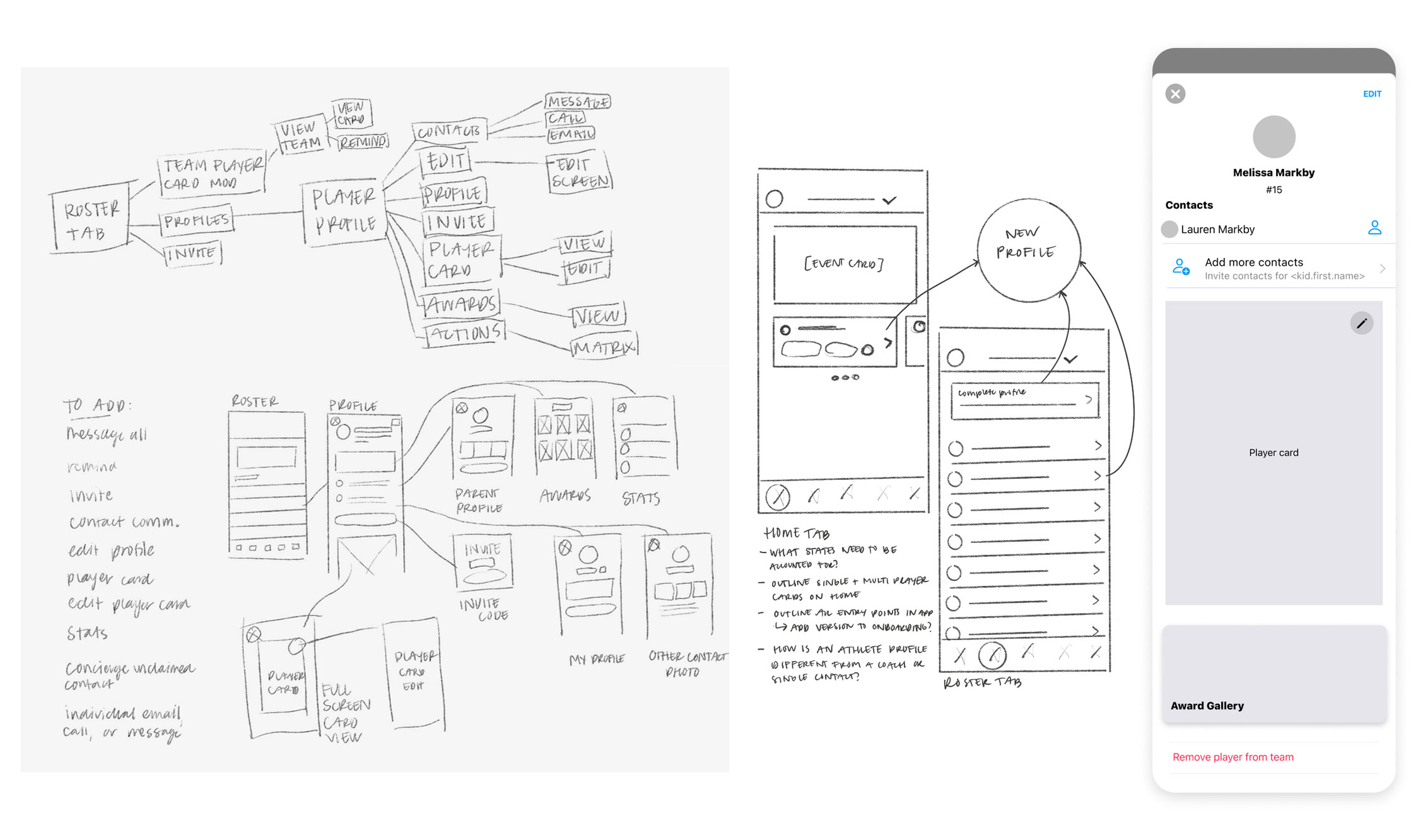
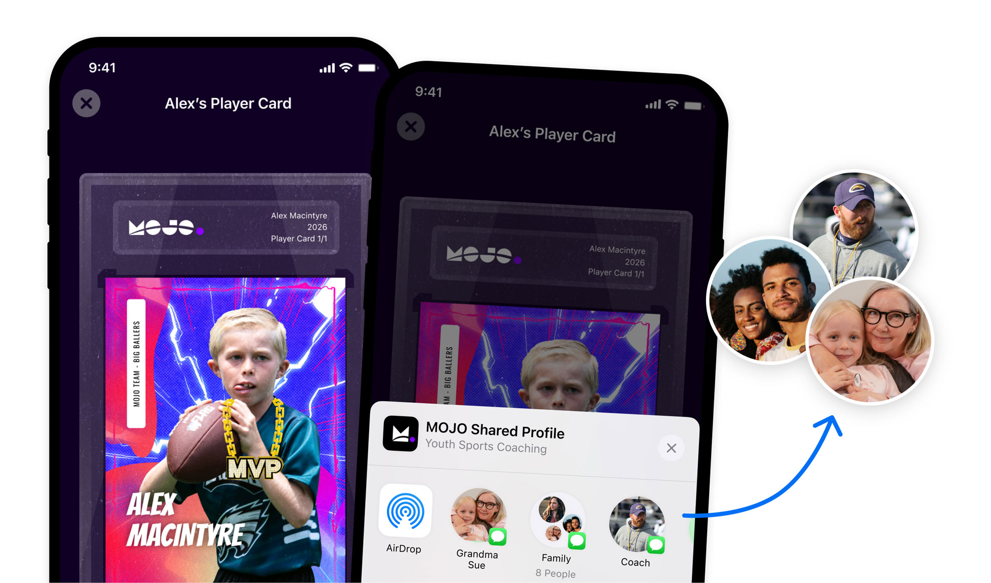
We carefully mapped user permissions early on, ensuring profiles for underage athletes were designed with safety and privacy in mind.

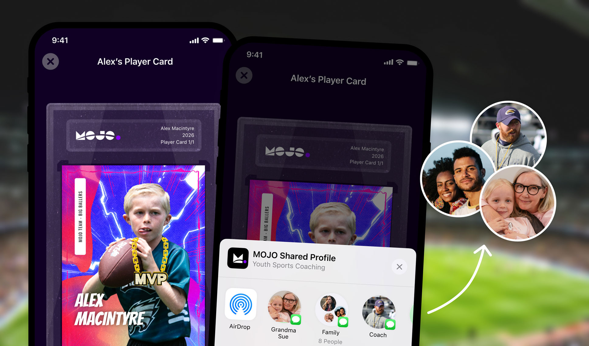
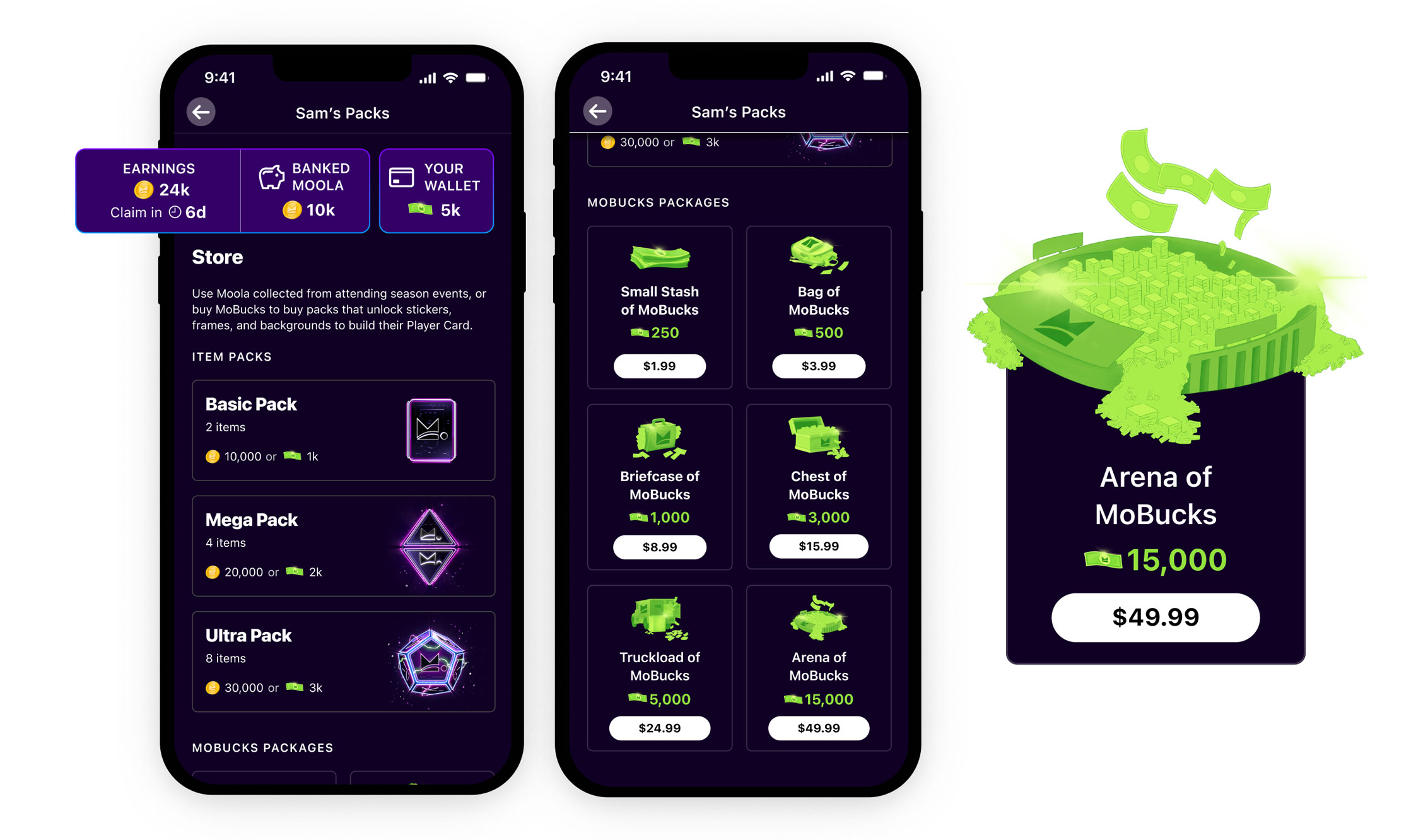
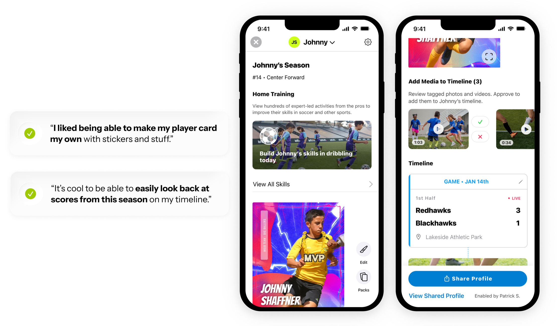
A key part of the profile was the Player Card, which lets users customize their card with stickers, photos, and more. We researched how gamifying the app could boost engagement and shape user expectations for pack openings.
TL;DR: This feature went through many iterations to reach its current state. We structured the work across five milestones, with contributions from both me and another designer. Key areas I focused on:
Key area 1: Player profile foundation
Defined which features to include, the overall goal, and how to sequence work. Determined key entry points for the profile.
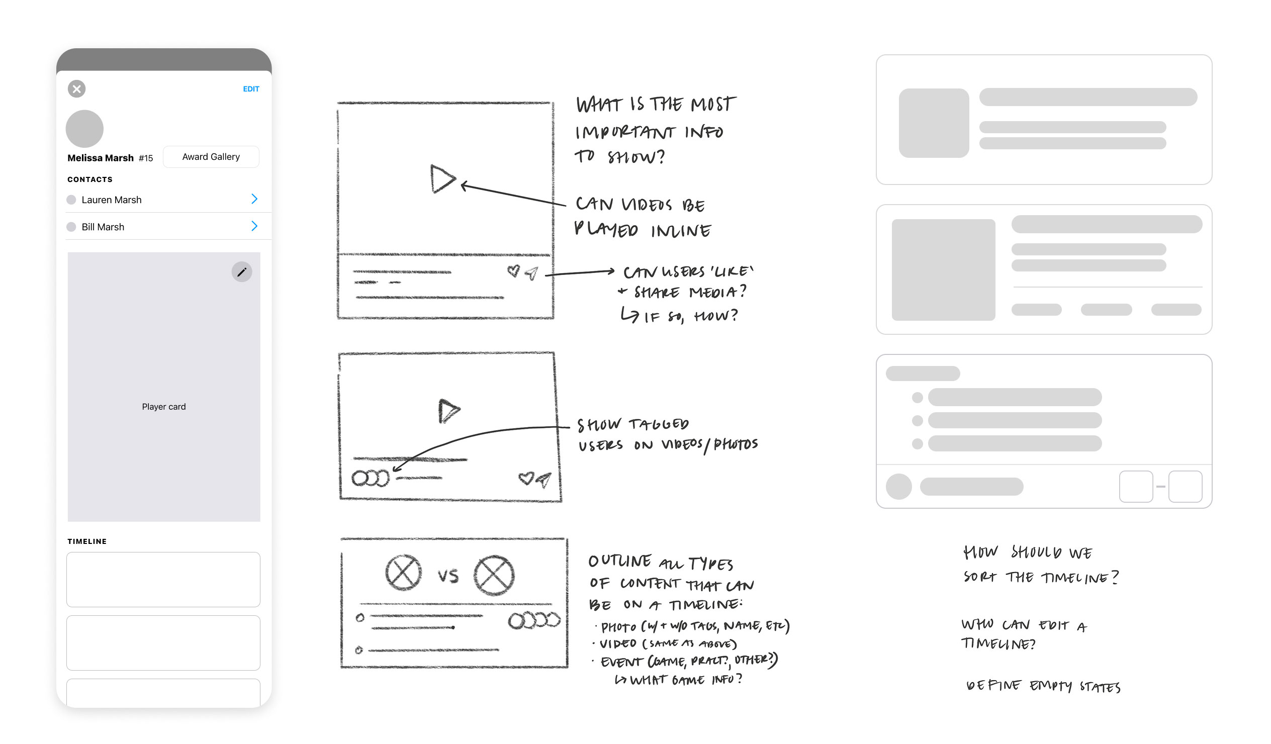
Designed ways for users to add photos and videos to their timeline, encouraging them to bring content they’re already capturing into MOJO. Considered who users want to share with and the value of curating their timeline.At the perspicuous of this project, we spent time outlining and defining what we wanted the profile tol ultimately be, and how we could sequence each aspect of it into a digestible and valuable experience. To simplify, we decided on starting with a profile that would include basic information about the player, the player’s contacts, an entry point to add a contact, a player card (and ability to customize it), and player awards.
To design the timeline and tagging features, we started by mapping how users would add and interact with content. What would a user put on their timeline? What memories would they want to showcase? Who would they share it with? We explored what types of photos and videos users were already capturing, and how we could encourage them to bring that content into MOJO.
From there, we defined tagging flows. Who users could tag, how tags would appear, and when we could inject tagging contextually into existing flows. We also considered sharing privacy, ensuring users could control who saw & shared their timeline. This was huge as we have youth athletes on the platform. This process helped create a timeline that felt engaging, easy to share with friends & family, and meaningful for users while reinforcing the overall fan experience.
The final design combined multiple features to establish a strong foundation for MOJO in the market. By layering fan experience features, the perceived value of the app increased, and user engagement with new features grew as we rolled out each milestone.
For users, the player profile created a more fun and interactive way to track memories, share highlights, and engage with their team. The functionality that let users share their profile to friends & family outside of the MOJO app increased engagement and drive revenue as it was a paid feature. As the profile stands today, there’s still room to optimize, test, and expand. We moved fast, iterated often, and learned a lot as a team. As we did so, we began setting the stage for MOJO’s continued growth.
Engagement:
Users who interact with their profile or player card early in the season stay more engaged. How can we test this insight moving forward?
Player card creation:
Parents and athletes enjoyed creating player cards, actively adding photos, stickers, backgrounds, and frames early on. How can we use these behaviors to increase and sustain engagement?
In-app currency user education:
An area for improvement is helping users understand how to earn in-app currency without paying. It wasn’t clear that attending events adds MoBucks to their wallet.
Due to an NDA, I cannot disclose the full spread of post-launch data. Contact me for more information!